

Uncovering Friction in Cart & Checkout to Drive Smarter, Simpler Purchasing
Packaging E-Commerce Platform | Sr. UX Researcher
Tools Used: Miro | Microsoft Teams | Qualtrics
Overview
The purpose of this study was to uncover key friction points in the purchasing flow of our B2B e-commerce platform. By identifying usability blockers and decision-making hurdles, we aimed to inform design improvements that streamline the end-to-end experience from product selection through checkout, ultimately boosting efficiency, user satisfaction, and conversion.
Research Methods
UX Audit: Conducted a heuristic analysis to identify usability gaps, UI inconsistencies, confusing copy, and overlooked edge cases across the checkout flow.
Secondary Research: Evaluated best-in-class e-commerce checkout patterns and UX principles to align recommendations with industry standards.
User Interviews: Led five 1:1 interviews with users to map end-to-end cart and checkout behaviors, expectations, and frustrations.
CX Survey: Deployed a cross-functional customer experience survey to quantify common user issues and validate themes emerging from qualitative research.
Impact at a Glance
Mixed-method study revealed 38% of users struggled to navigate the e-commerce platform, directly informing product and support strategy.
UX Audit
As part of this research, I conducted an in-depth analysis of the cart and checkout experience, mapping each screen and interaction in Mural. This allowed me to identify key usability and workflow issues within the purchasing process. While I can only share high-level insights due to company confidentiality, I’m happy to discuss more details upon request.
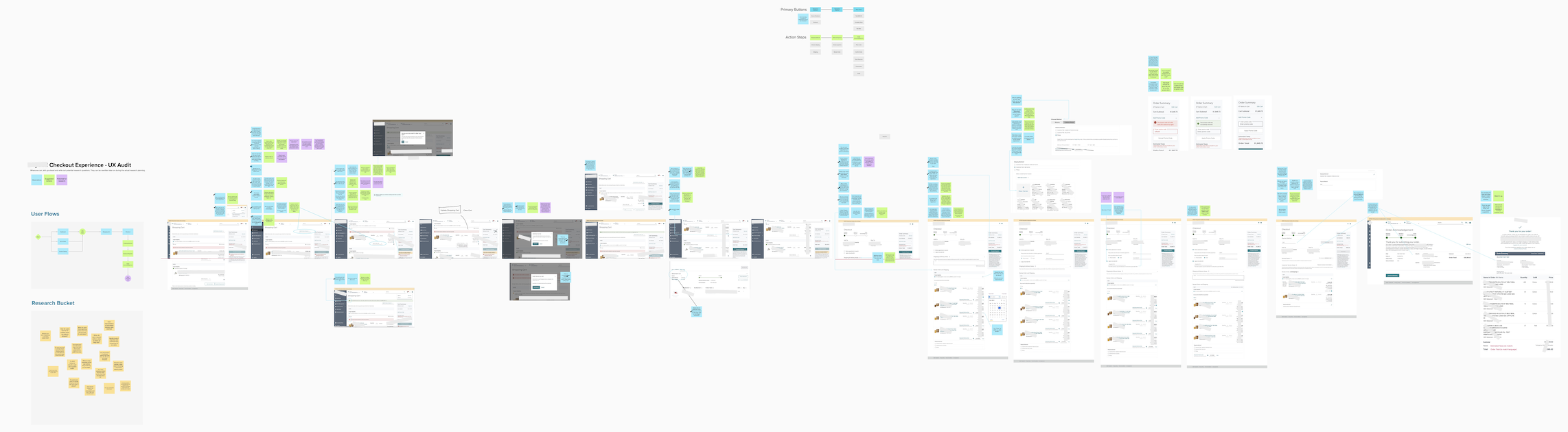
Cart & Checkout Improvement Opportunities
Enhance User Clarity & Trust
Clarify Freight Eligibility thresholds and remaining amount needed.
Unify Terminology across all pages (e.g., “My Cart” vs. “Shopping Cart”).
Standardize Banner Styling for consistent look and feel.
Improve Promo Code messaging and behavior consistency.
Simplify Navigation & Flow
Reduce CTA Redundancy by consolidating “Place Order” buttons.
Align Payment Placement between Shipping and Review steps.
Fix Cart vs. Order Summary UI discrepancies to avoid confusion.
Improve Usability & Accessibility
Align step indicators and input fields to reduce cognitive load.
Redesign Date Picker for clearer selection and accessibility.
Correct Form Controls usage (checkboxes, asterisks) following standards.
Standardize Modal sizes and Typography for a cohesive experience.
Increase Content Visibility
Surface important content earlier by addressing info buried below the fold.
Secondary Research
UX Best Practices for Cart & Checkout
CTA Visibility: Ensure call-to-action buttons are highly visible, placed near related content, and styled with contrasting colors and clear, action-oriented labels to increase clicks.
Consistent Copywriting: Use clear, user-friendly language with consistent terminology (e.g., “Credit Card Number” vs. “Card #”) to reduce confusion.
Required Field Indicators: Clearly label required fields using text or inline cues instead of relying solely on asterisks, improving accessibility and comprehension.
Field Validation & Error Feedback: Provide real-time validation and consistent visual indicators (e.g., red highlights) for errors to guide user correction efficiently.
Pickup vs. Shipping Options: Differentiate fulfillment options with benefits highlighted (e.g., cost savings with in-store pickup) to support informed decision-making.
Flexibility in Flow: Allow users to save progress or return later, especially for complex B2B purchases, reducing abandonment risk.
Delivery & Shipping Transparency: Clearly display all available delivery methods, timelines, and associated costs to build trust and reduce surprises.
Cost Transparency: Surface all charges upfront—including taxes, fees, and freight—to avoid last-minute abandonment due to hidden costs.
Timeline Expectations: Communicate estimated delivery or fulfillment times early in the process to set accurate expectations.
Support Accessibility: Offer immediate access to support channels (e.g., live chat, phone, FAQs) to assist users during decision points.
Promo Code Clarity: Provide a clearly labeled, easy-to-locate field for promo codes, along with guidance if formats are specific.
Clean, Minimalist UI: Maintain a clutter-free layout that emphasizes key actions and reduces cognitive load.
Useful Resources | How to Create the Perfect Checkout Experience in 9 Simple Steps / How To Improve Ecommerce Checkout: 14 Tips / Checkout UX: Designing the Experience Your Customers Deserve / Checkout UX Best Practices 2024 — Baymard Institute
User Interviews
Participants: 5 | Roles(s) Represented: Purchasing & Management | Personas: Protective Packaging Customers
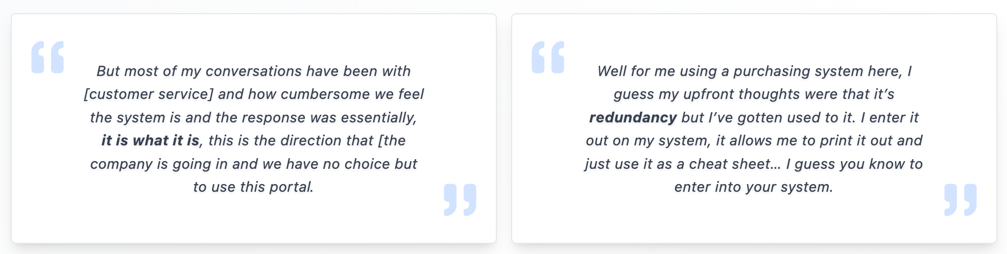
Most customers described the onboarding experience as smooth and well-supported. However, several noted that the transition to the e-commerce platform felt imposed rather than optional. This shift introduced frustration—particularly due to repetitive order entry workflows that contrasted with the ease of their previous offline methods.
Customer Purchasing Behavior Insights
Cart Experience: Most customers find adding items to their cart straightforward and easy to navigate.
ERP System Integration: 100% of customers copy material numbers directly from their ERP systems instead of searching by keywords. Customers suggested integrating ERP systems with the purchasing portal to reduce repetitive tasks like importing purchase orders.
Prepaid Freight: 60% of customers complete purchases only when they qualify for prepaid freight.
Lead Times & Partial Shipments: 60% of customers say estimated lead times impact their ordering decisions. Customers frequently contact customer service regarding partial shipments. They expect estimated delivery dates to reflect the item with the longest lead time.
Product Discovery: 60% prefer to contact sales representatives or customer service for help rather than browsing the Product Catalog on their own. / “Sometimes really finding product is the biggest problem...” - Customer

Delivery Appointments: 60% use the delivery appointment feature. Customers would like the ability to save a default contact to avoid re-entering information every time.
Order Updates: 100% expect email notifications for order delays and 60% also expect updates directly through the shopping platform.
Cart & Checkout Confusion
Freight Eligibility: 60% found the interface unclear, struggling to determine the additional cost or materials needed for prepaid freight. Percentages used in the UI added to the confusion.
"Load Last" Option: 80% found this feature unclear; one customer believed it meant their product selection might be short or extra items might be added if space allowed. The current UI requires a selection instead of defaulting to one.
"Clear Cart" Visibility: 60% had difficulty locating this option.
Common Customer Service Touch-points
Order Adjustments: A customer may have ordered the wrong quantity of a material and requires help adjusting their order.
Delivery Date Requests: Customers may need help selecting a delivery date not available on the platform.
Product Availability: Customers may need to verify if a product is in stock before placing an order.
Prepaid Freight Issues: Customers with overfilled trucks may require customer service to manually select Prepaid Freight.
Product Availability: Customers may struggle to find products not available on the platform, often due to a lack of recent purchase history; specifically if they haven’t purchased the product in the last 12 months.
New Delivery Address: Customers may request the addition of a new delivery address for their end customer.
At the time of this study, the platform offered three note fields for customers to provide additional information during checkout: Shipping & Delivery Notes, Customer Service Notes, and General Notes. While these allowed for clarifications, they increased the customer service workload as each note had to be reviewed after the purchase. Stakeholders wanted insight into which note fields were most used and important. Many users frequently rely on offline assistance, as evidenced by their regular use of the platform's note feature.
80% of customers use the Shipping & Delivery Notes.
60% use the Customer Service Notes.
0% use the General Notes, leading to its removal after the study.
CX Cart & Checkout Survey – Usability Feedback
Total Responses: 21 | Persona: Packaging Customers
Customer Insights
Customer feedback on the e-commerce B2B purchasing platform revealed mixed perceptions of usability compared to other e-commerce experiences:
43% of customers found the platform to function similarly to other e-commerce platforms—suggesting a baseline level of familiarity and comfort.
38% reported the platform was more difficult to navigate, highlighting key areas for usability improvement.
19% found the platform much easier to use, indicating that some elements of the experience are resonating positively with certain users.
Recommendations
Multi Add to Cart Functionality: Enable customers to copy/paste multiple material numbers at once, reducing friction for high-volume buyers.
ERP Integrations: Support popular ERP integrations to eliminate duplicate entry and increase operational efficiency.
Search Feedback for Historical Orders: Clearly notify users when products don’t appear due to inactivity (e.g., not ordered in 12+ months).
Delivery Appointment - Default Contact: Let users save a default contact for delivery, reducing repetitive data entry at checkout.
Estimated Lead Time Transparency: Improve messaging on lead times—online and offline—to reduce uncertainty and service calls.
Delayed Shipment Notifications: Add platform alerts and messaging to explain reasons for shipment delays.
Freight Eligibility UX: Redesign the freight eligibility interface to clarify how users qualify for prepaid freight.
“Clear Cart” Visibility: Increase the size of the "Clear Cart" button and position it according to user experience standards.
Remove General Notes: Remove unused “General Notes” field due to lack of use and to reduce noise.
“Load Last” Default Logic: Auto-select a default “Load Last” material, with optional override—reducing extra steps.
Improve Customer Assistance Lead Time: Ensure customers receive timely assistance, especially since some may feel forced to use the platform.
Outcomes
Based on these insights, the team prioritized and implemented the following improvements. Other recommendations are under review for future roadmap consideration based on feasibility and business alignment.
Simplified freight eligibility UX, reducing confusion and increasing qualification clarity.
Removed the "General Notes" field, decluttering the checkout process.
Added the ability to save a default delivery appointment contact, streamlining repeat purchases.