
BBVA Compass Mobile App
Add More Products

Overview
Applying for a new account in the Mobile App: Currently a customer is presented with a drop-down offer within the Dashboard of the Mobile App, advertising opening a new account. Once the customer clicks on the drop-down it redirects them to the public website. Once on the public website the customer is presented with multiple account application links within the Dashboard that does not include links for accounts they already have. This prevents the customer from applying for accounts they already have (ex: opening up an additional checking account). If the customer is interested in an application, they click the Apply Now link which opens the application form. Upon reviewing the information they are then prompted through the application process.
The Problem
When using the current Mobile App the customer does not have easy access to add a new account or additional accounts within the Mobile App, having to navigate the public website before accessing the application form.
The Goal
To provide an improved Mobile App experience for customers who apply for an account. The new process will present all of the available Account types in one easy to find location and allow the user to go directly to Online Account Opening to apply for the account of their choice without having to navigate through the public website first.
Business Requirements
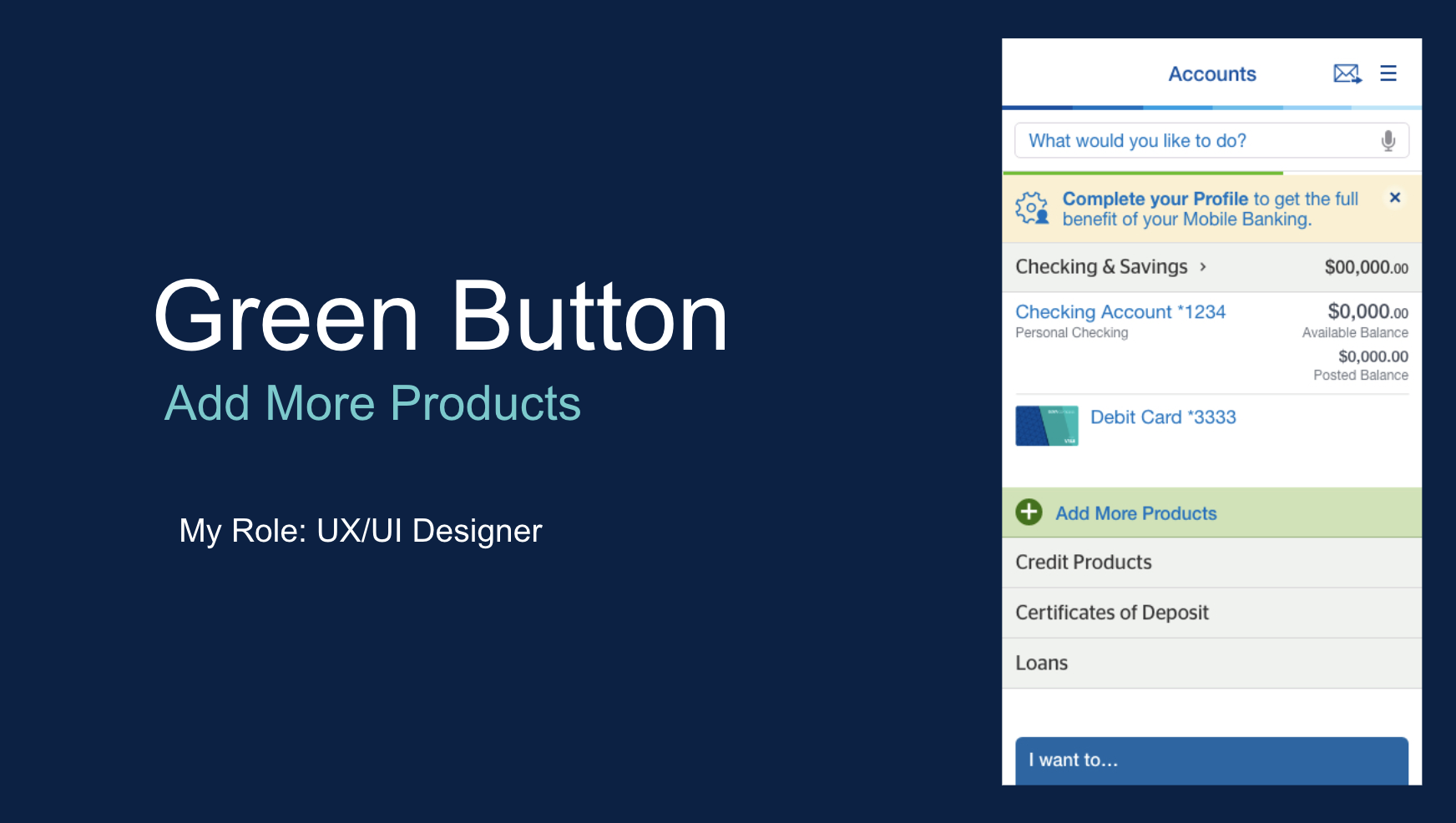
Display a banner with a Green Plus sign link and the words: “Explore Our Banking Products” below first section of customer accounts on the Dashboard of the Mobile Application.
This link will replace the current location of CRM but be fixed in this spot. When a customer scrolls up it may disappear from view.
The CRM ad placement will change on the dashboard. It will move to the top of the Dashboard but below the UMG message and mobile widget message when there is one active.
Remove the Apply for an Account option from the “I want to” menu.
My Role
UX/UI Designer
Team Players
Susan Reid: DIY Channels Product Manager for Mobile & Online Banking
Ryan Davis: Lead Designer and Manager for Online & Mobile Banking
Legal & Compliance Team
Development Team
Duration
2-3 months of collaboration and design
The Proposed Solution / Why do customers need this?
The solution to create the green button was selected to allow BBVA to report on customer behaviors at a more granular or accurate level. Accurate reporting ensures more effective customer targeting for marketing campaigns which in turn helps to increase sales. This solution will also assist in better serving customers, increasing customer satisfaction, thus improving BBVA’s net promoter score. By providing all of the account options in one easy to find location to apply for any account, this button will increase the number of applications initiated from the mobile channel while providing the customer with a better experience.
My Process
Review current functionality and the problem it creates. Once the main problem is clearly defined, the purpose is clear.
In order to create a solution from the purpose, I break the problem down into smaller steps to solve individually.
Review business requirements for the project with the Product Owner.
These are the requirements that must be met to create a solution for the project that will help shape the customer journey while meeting the company’s overall design image and branding.
Wireframe initial layouts.
This will determine the most logical route for the customer to take when using the new function.
The wireframe will become the base for the prototype through initial function review and development.
The prototype roughs are then presented to the Lead Designer, Product Owner, and the Business Analyst to critique and improve. Engineering is also consulted with at this time to understand how the new function will be implemented so that any necessary changes can be made at this stage to prevent any future engineering-driven revisions.
Once prototype has been revised it is reviewed within a weekly design meeting with stakeholders and management to get buy-in on implementation.
After getting buy-in the prototype is revised to create a strong base product that can be user tested.
User Testing is performed on the prototype to get both positive and critical feedback from a customer point of view.
Implement any user findings into the prototype to counter measure any critical feedback. Positive feedback is necessary to know what is working in the prototype and to maintain the customer experience. Critical feedback is necessary to know what isn’t working in order to improve the customer experience.
Support handoff to Engineering Team to begin development, ironing out any problems created through app engineering.


Research Insights
Out of six options, the top two preferences for the wording of the “green button” were:
“Get New Accounts & Services”
“Get New Accounts & Services.”
With these results in mind and after discussing everything that this button would cover with stakeholders, the team decided to use “Add More Products” for the naming of the Green Button. In order to add insurance down the road, the wording needed to include “Products” since Insurance is not a type of account.

Overall Findings
All testers said that they noticed the Magic Green Button and all but two understood immediately that it was clickable.
All said they felt the overall presentation of the link was good. Some suggested different placement on the screen, such as at the top or bottom instead of in the middle.
All had a clear understanding of the purpose of the link. Some expected the link to expand into a dropdown menu of types of accounts to apply for, others thought it would link to a new page with these options.
What I Learned
The importance of user testing By getting critical feedback from the users we were able to choose the best wording for this new feature. By getting positive feedback we were able to understand what was working for this new feature.
The importance of teamwork collaboration throughout the project’s life cycle. By reviewing with my team, I was able to identify problems and make corrections throughout the prototype process to improve the final product.
Designing for scalability. Example: Testing the size of the “New” and “Resume” buttons on our Green Button as well as testing for the font size on a test phone vs the mobile prototype is important to make sure that customers of all ages are able to read the button title.