This project is currently being added to my portfolio, stay tuned.
Enhancing an Email Feature to Increase Usage
SaaS Ministry Platform| Product Designer II & Researcher
Tools Used: Whimsical | WalkMe | Typeform | Sketch | Adobe XD
Overview
For this project, I led the user research and UX design efforts to improve the email functionality within the FellowshipOne platform. Usage analytics and customer feedback consistently showed that the existing email tool was underutilized, signaling both usability challenges and feature gaps.
By identifying pain points, validating needs with stakeholders, and refining the design based on user insights, I worked to transform the email feature into a more intuitive, efficient tool that better aligned with customer workflows and expectations.
Known Email Feature-Related Customer Pain Points
Before beginning this work, customer feedback, primarily gathered through a large survey in 2019 consistently highlighted several key pain points with the existing email functionality. A few of these pain points included the following:
Limited attachment size: Users were frustrated by restrictive file size limits for attachments.
No scheduling options: Customers expressed strong demand for scheduling emails and automating reminders.
Formatting loss when pasting content: Pre-designed content often lost formatting when pasted into emails.
Inconsistent layout in group emails: Layouts frequently appeared distorted or "squished" when sent to large groups.
My Process
Discovery → Ideation & Low-Fidelity Exploration → User Research & Testing → UX Refinement → Additional Research (as needed) → High-Fidelity Design Solution → Developer Handoff & Ongoing Support
Research Methods
Click Tracking Analysis (via WalkMe): Analyzed user behavior patterns and engagement hotspots to identify friction in the current email experience.
Information Architecture Audit: Conducted a comparative review of the current structure alongside proposed improvements to evaluate content hierarchy, navigation clarity, and feature accessibility.
Usability Interviews
Impact at a Glance
The improvements increased the email feature’s usability and addressed known customer needs, ultimately enhancing FellowshipOne’s value to customers and driving higher feature adoption.
Email Feature Click Tracking Analysis (30-Days Via WalkMe)
Using WalkMe’s click tracking, I identified the top 10 most-used email formatting actions over a 30-day period. This early insight ensured that frequently used features were prioritized, easily accessible, and intuitive in the redesigned email experience.
Usage data in WalkMe showed the most commonly used email actions, ranked from most to least frequently used:
Bold
Font Size
Attach a file
Insert/Edit link
Font family
Italic
Spellchecker
Underline
Bullets
Undo
Information Architecture & Experience Audit
Following a thorough review of the existing email feature, I identified several critical areas for improvement. These findings were shared with the Product Owner to inform the creation of user stories and acceptance criteria for upcoming enhancements.
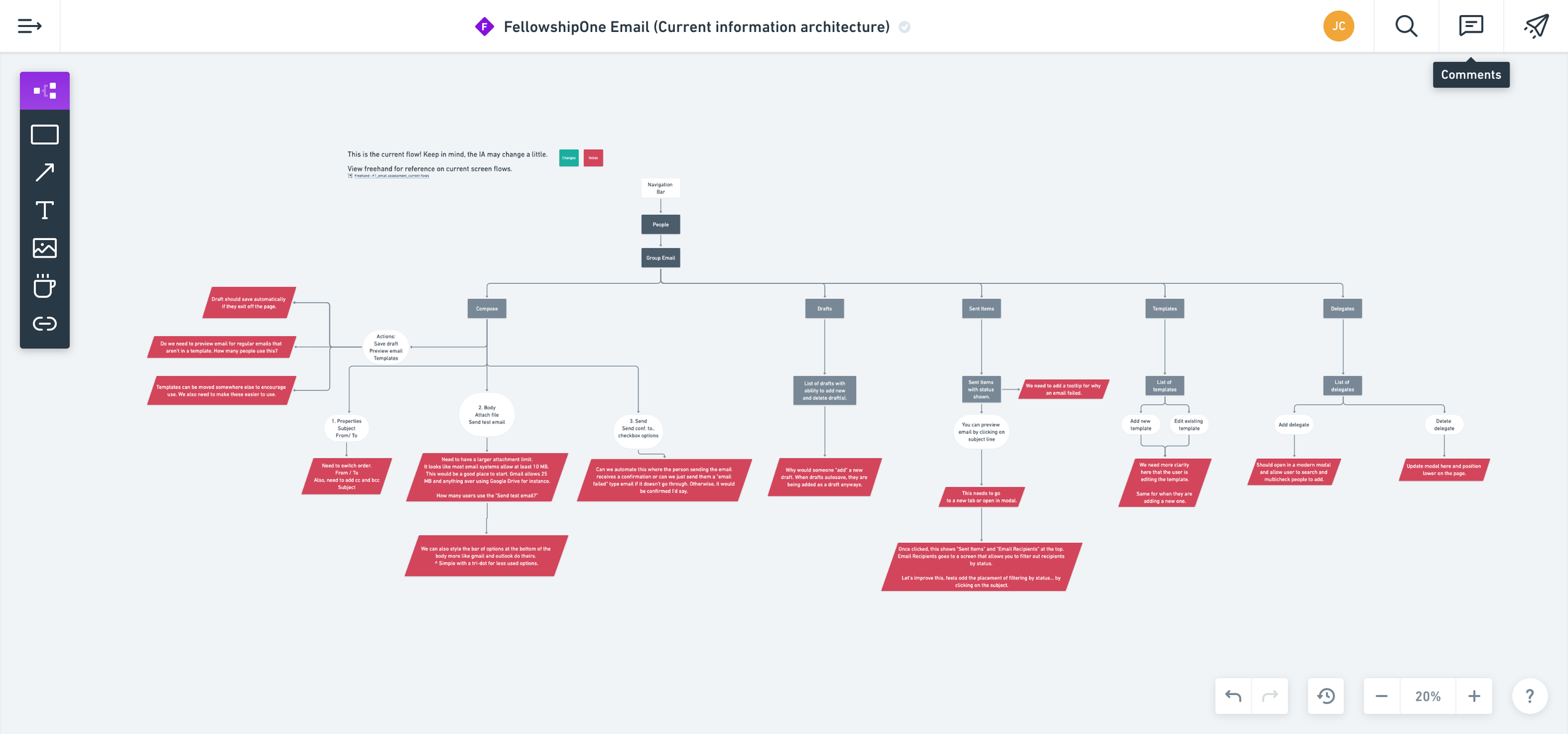
Current State - Email Information Architecture Review
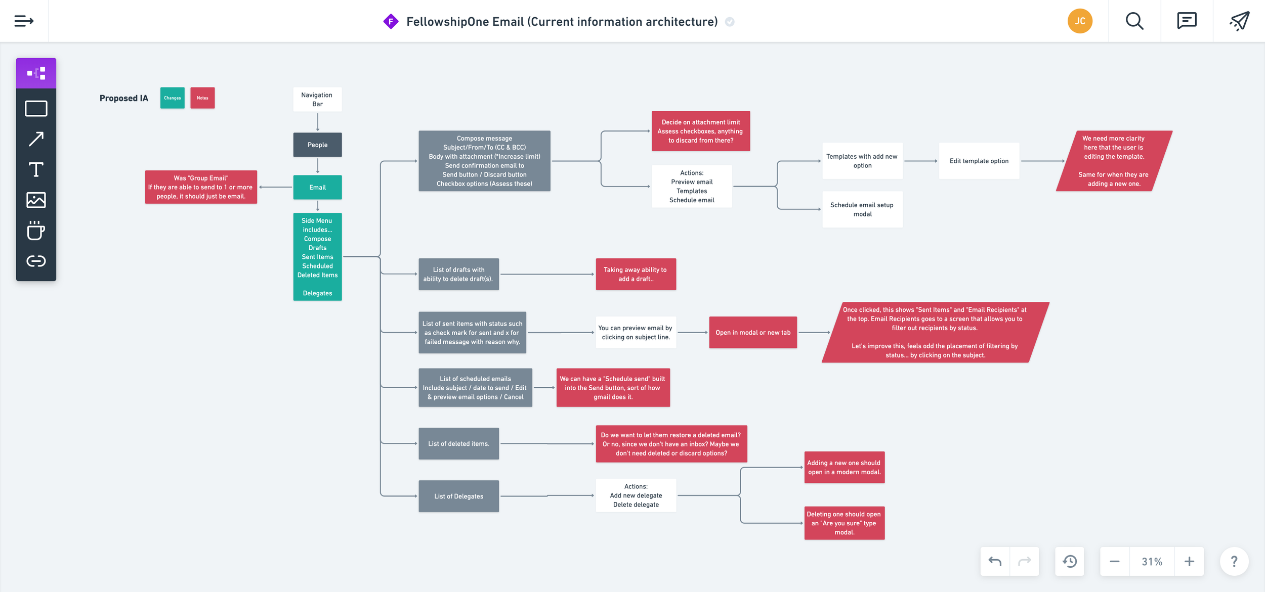
Future State - Proposed Email Information Architecture
Email Feature | Current State Insights to Drive Improvements
Fragmented Navigation: Email functionality was split across multiple areas in the top navigation, requiring unnecessary clicks to access related actions. For example, users had to navigate separately to “Sent” to view sent emails, rather than accessing them via tabs within a single, centralized email workspace.
Lack of Autosave for Drafts: Email drafts did not autosave, creating risk of lost work and workflow interruptions.
Underutilized Templates: Templates were buried within the feature and not easily discoverable, missing an opportunity to support customer efficiency.
Missing CC and BCC Options: CC and BCC functionality was absent, limiting flexibility in recipient management.
Attachment Size Limitations: Restrictive file size limits on attachments remained a known source of user frustration.
Confusing Draft Creation Flow: The “New Draft” call-to-action felt counterintuitive, especially given the lack of autosave or manual save options.
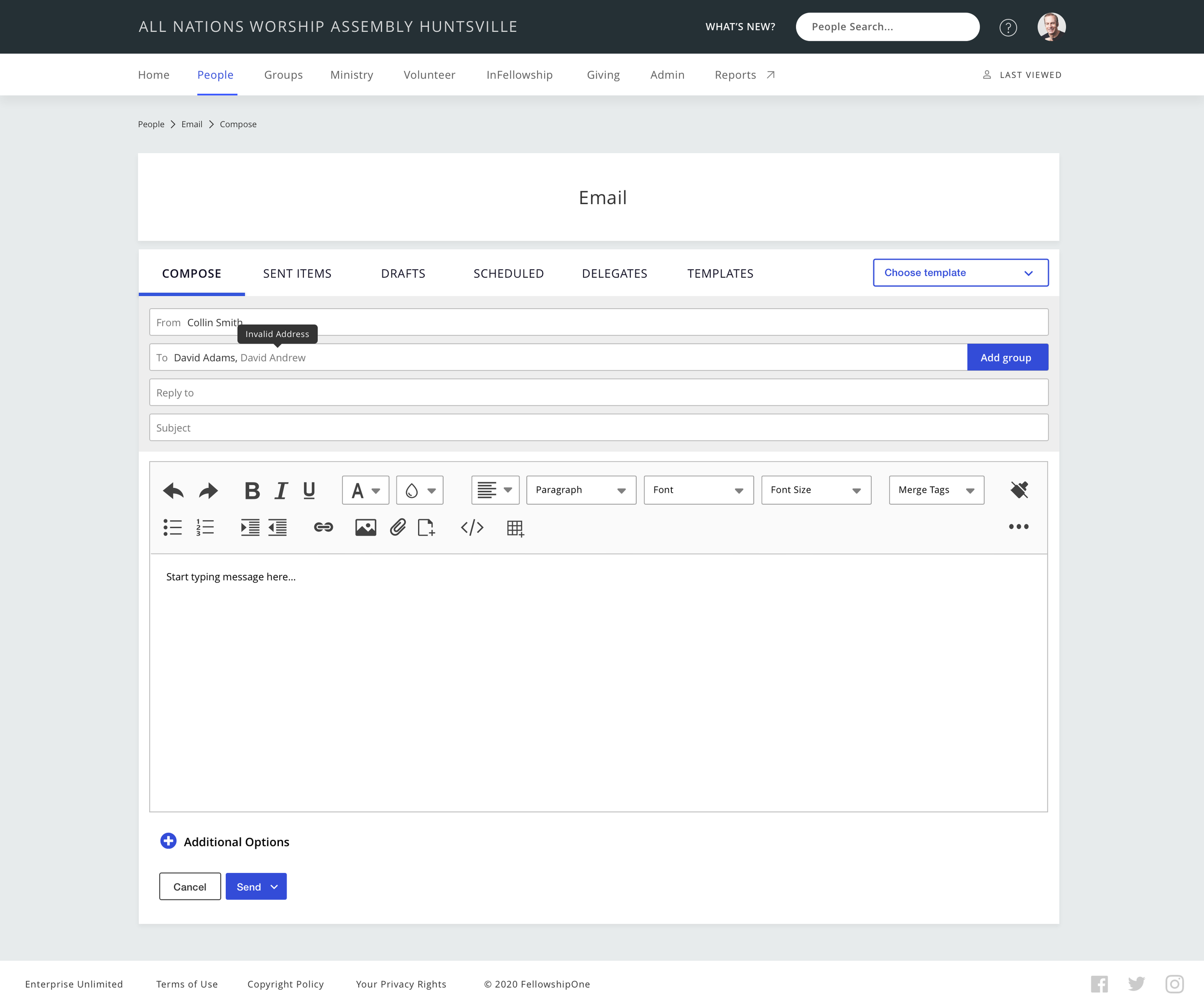
Insufficient Failure Feedback: Users received little to no feedback when an email failed to send, impacting transparency and trust in the system.
Email Feature | Future State Recommendations to Drive Adoption
After reviewing the current information architecture and the insights shared above with the Product Owner, I redesigned the information architecture and proposed the following improvements:
Created a New Communications Section in Navigation: Introduced a new Communications section in the top navigation as a consolidated hub for messaging features, making room for both email and the upcoming mass texting capability.
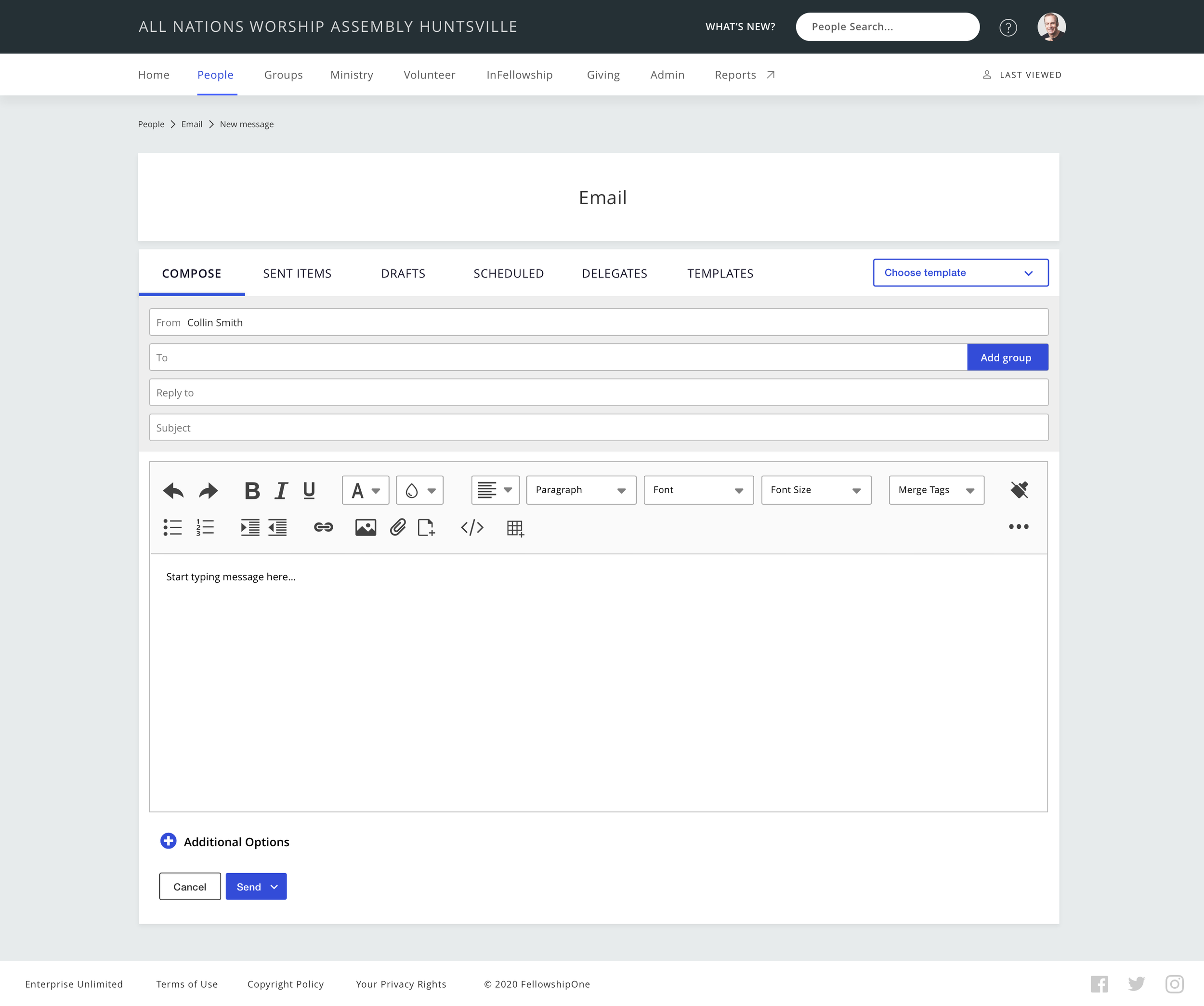
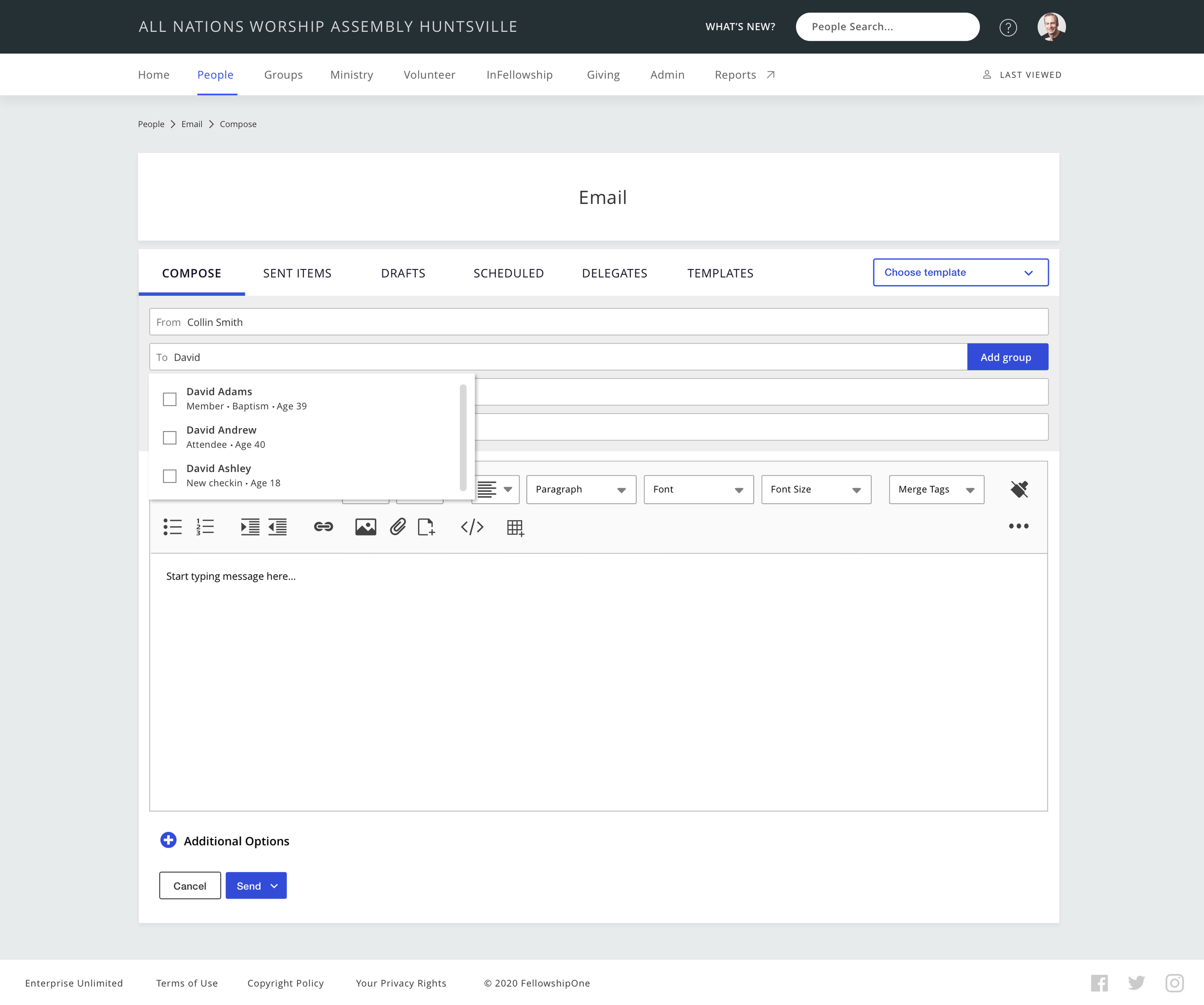
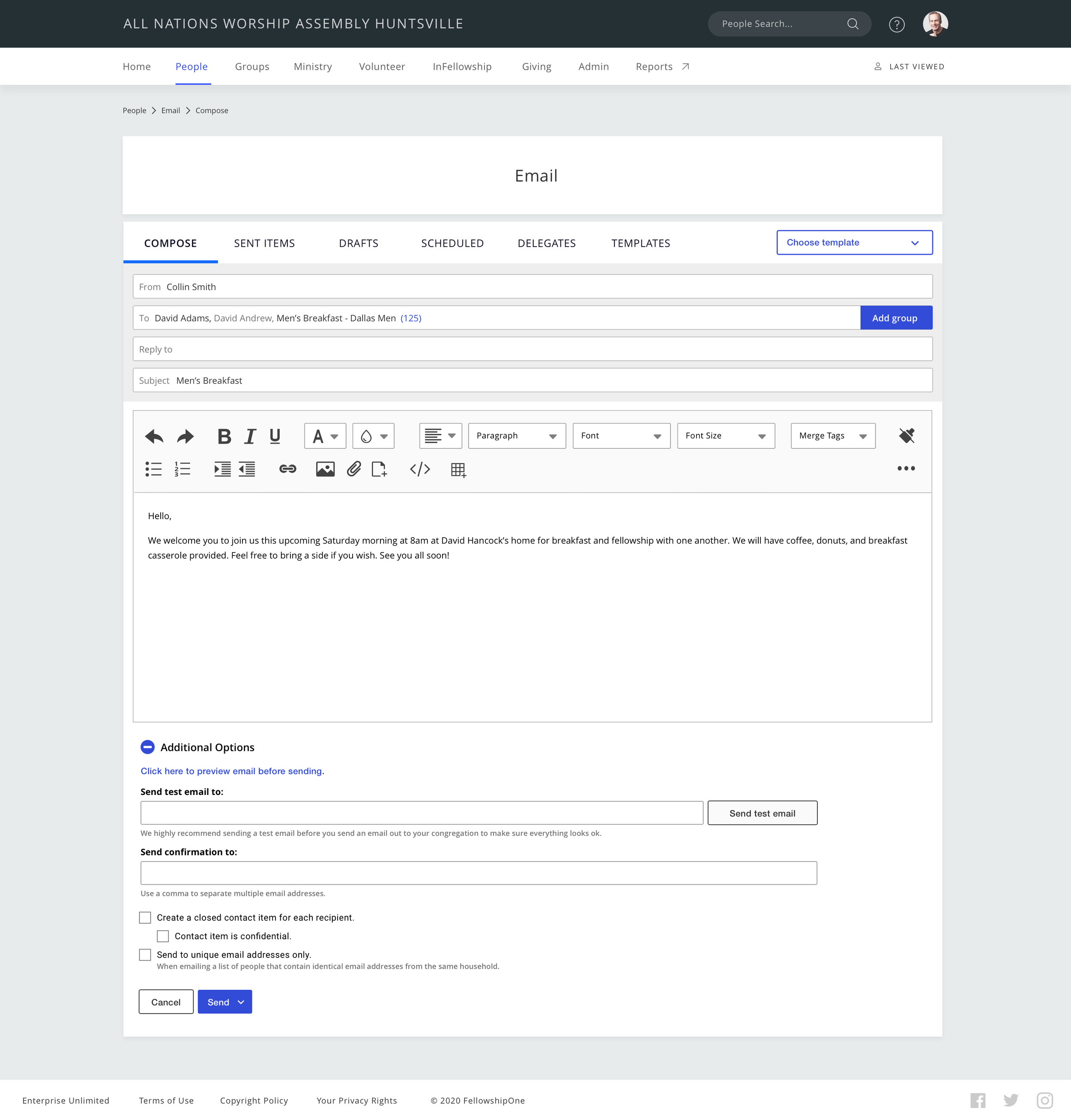
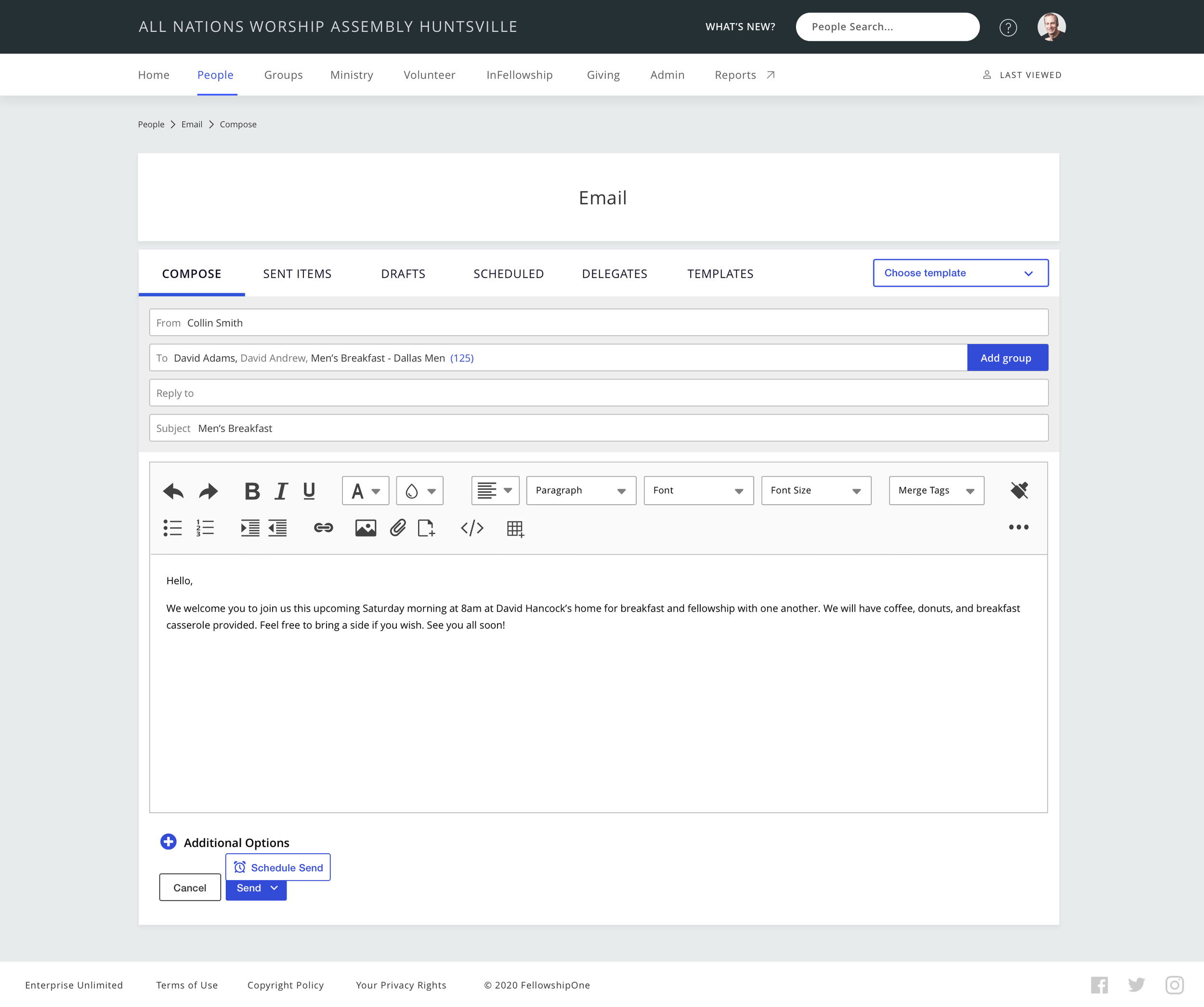
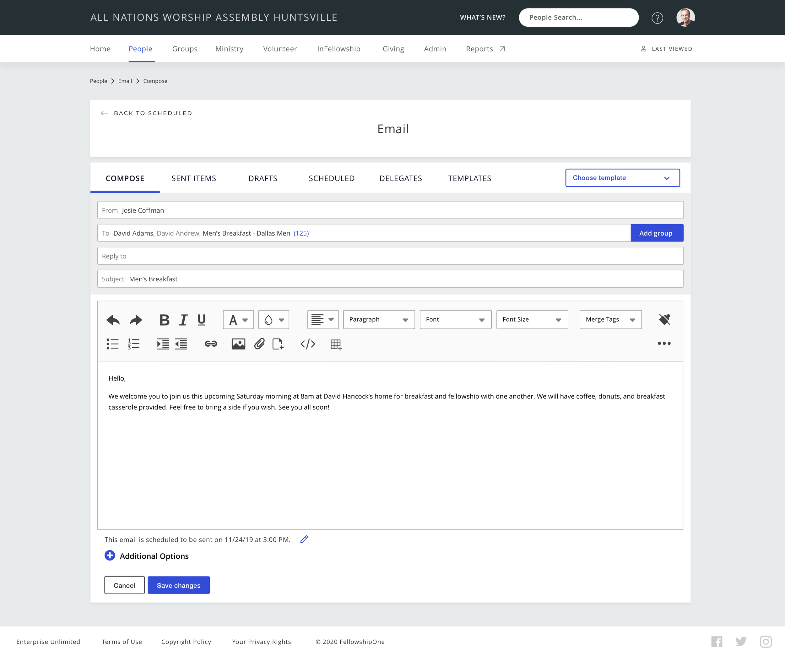
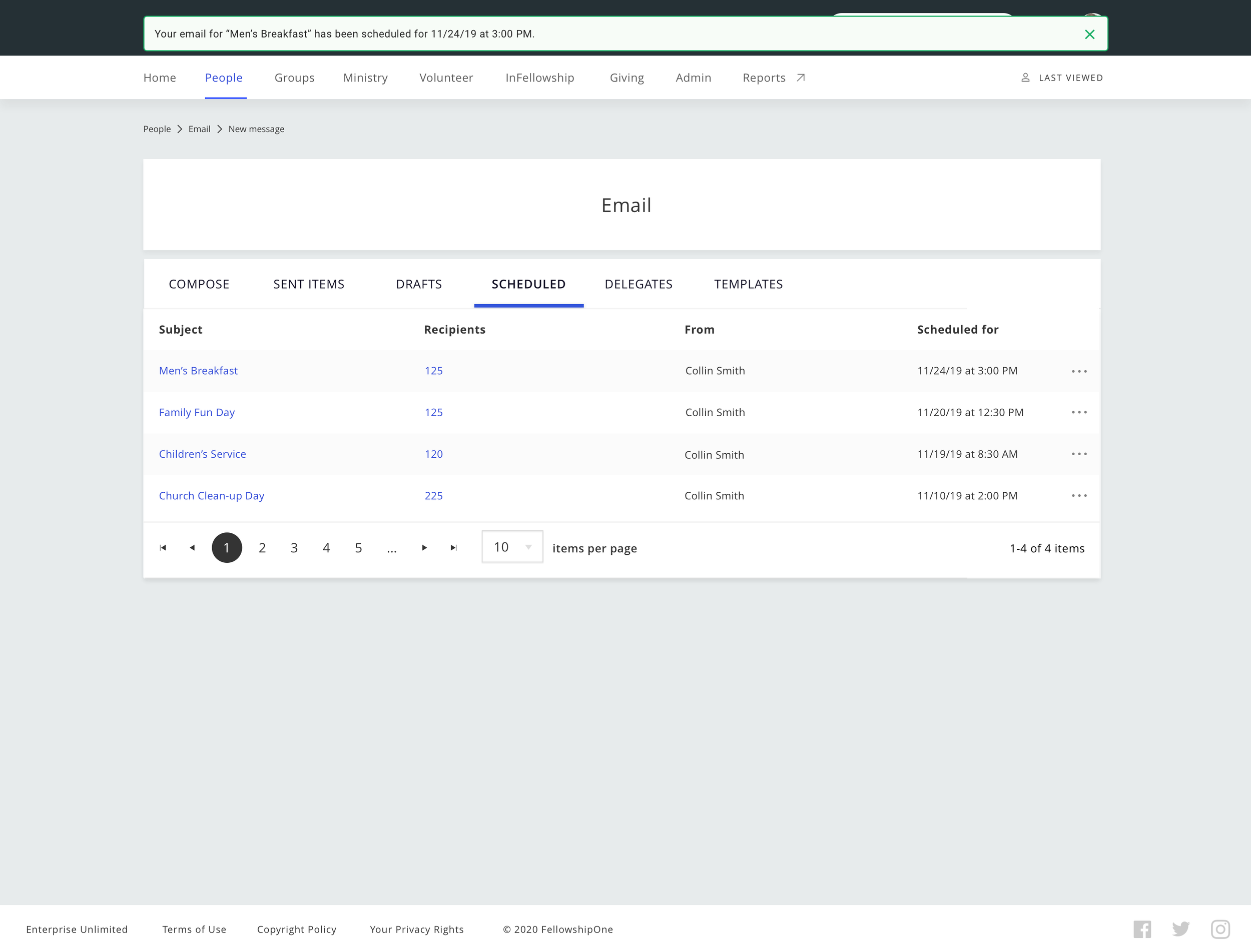
Consolidated Email into Side Tab Navigation: Redesigned the email feature within the Communications section to include side tab navigation consolidating key functions — creating new emails, drafts, sent items, scheduled emails, deleted items, and delegates — into a single, easy-to-navigate space, replacing the previously fragmented email links in the top navigation.
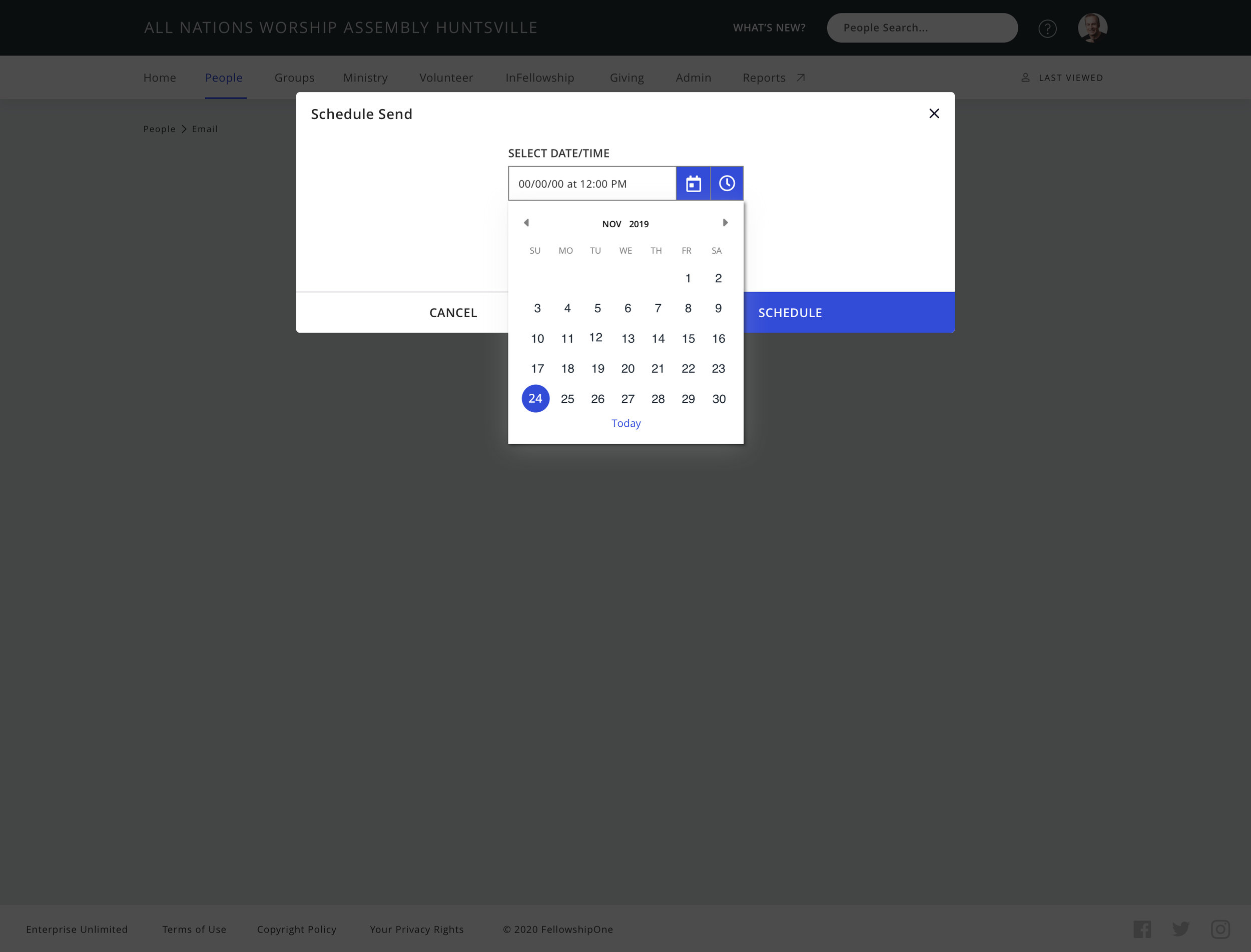
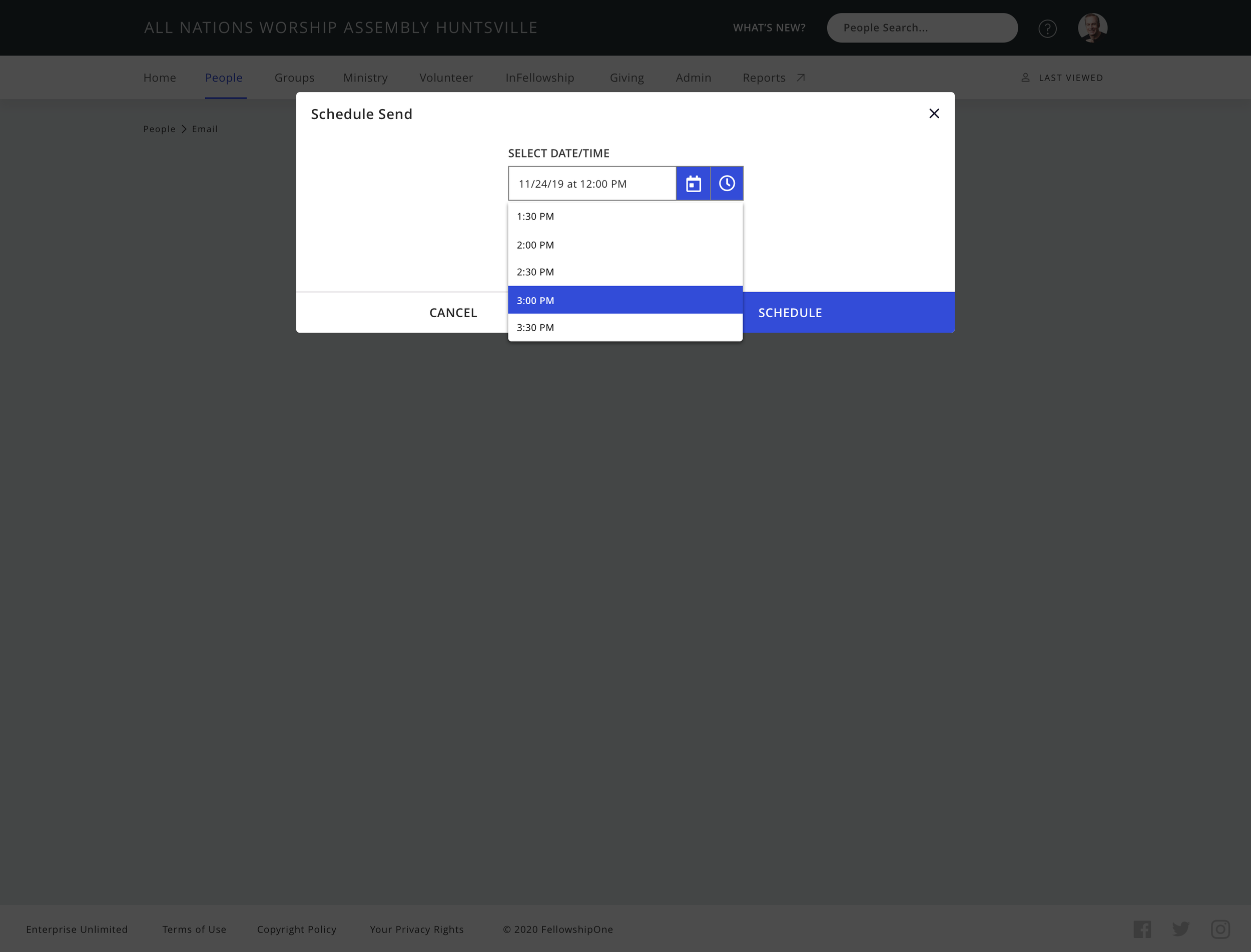
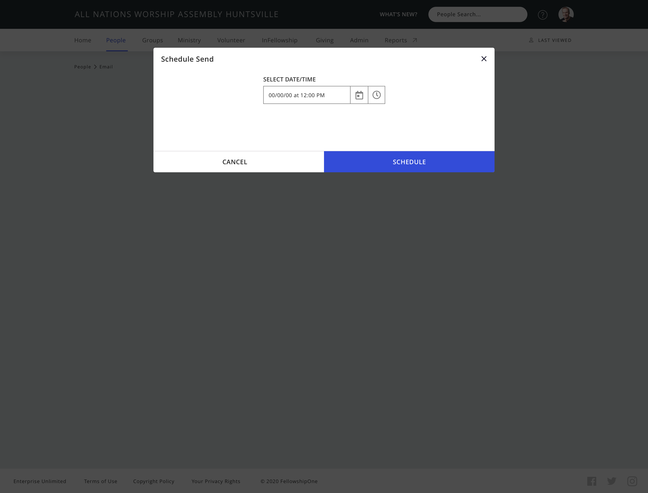
Email Scheduling: Introduced the ability to schedule emails for future delivery. (Addresses known pain point: Lack of scheduling options.)
Increased Attachment Size Limit: Enabled users to attach larger files, reducing friction and user frustration. (Addresses known pain point: Limited attachment size.)
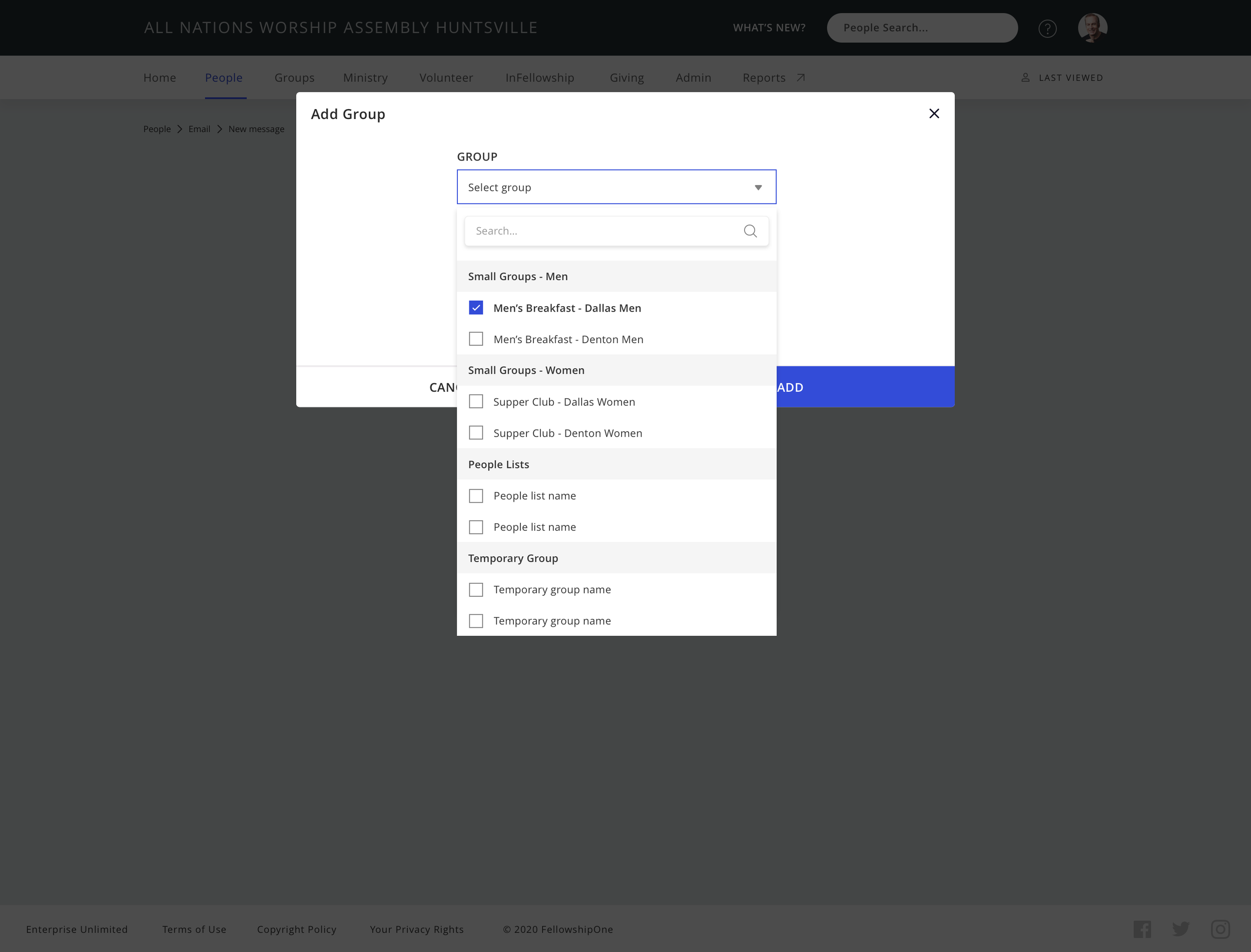
CC and BCC Options: Added CC and BCC fields to expand recipient management options. (Addresses known pain point: Missing CC and BCC options.)
Enhanced Email Preview: Improved usability and clarity when previewing emails.
Modern Modal Actions: Consolidated multiple actions into streamlined, intuitive modal dialogs.
Surfaced Email Templates: Made templates more easily accessible as a quick action during email creation to boost efficiency. (Based on usage insights showing underutilization.)
Prioritized Sent Email Statuses: Added clear status indicators for sent emails to improve user feedback and transparency. (Discovered during audit as an experience issue: insufficient failure feedback that impacted trust.)
Low Fidelity Email Experience
Based on product requirements and insights from customer feedback and the audit, I designed a vertical tab experience. It included creating and scheduling emails, viewing sent emails with status indicators, accessing drafts, managing scheduled emails, and handling delegates, addressing key usability and feedback improvements.


Usability Testing Script Planning
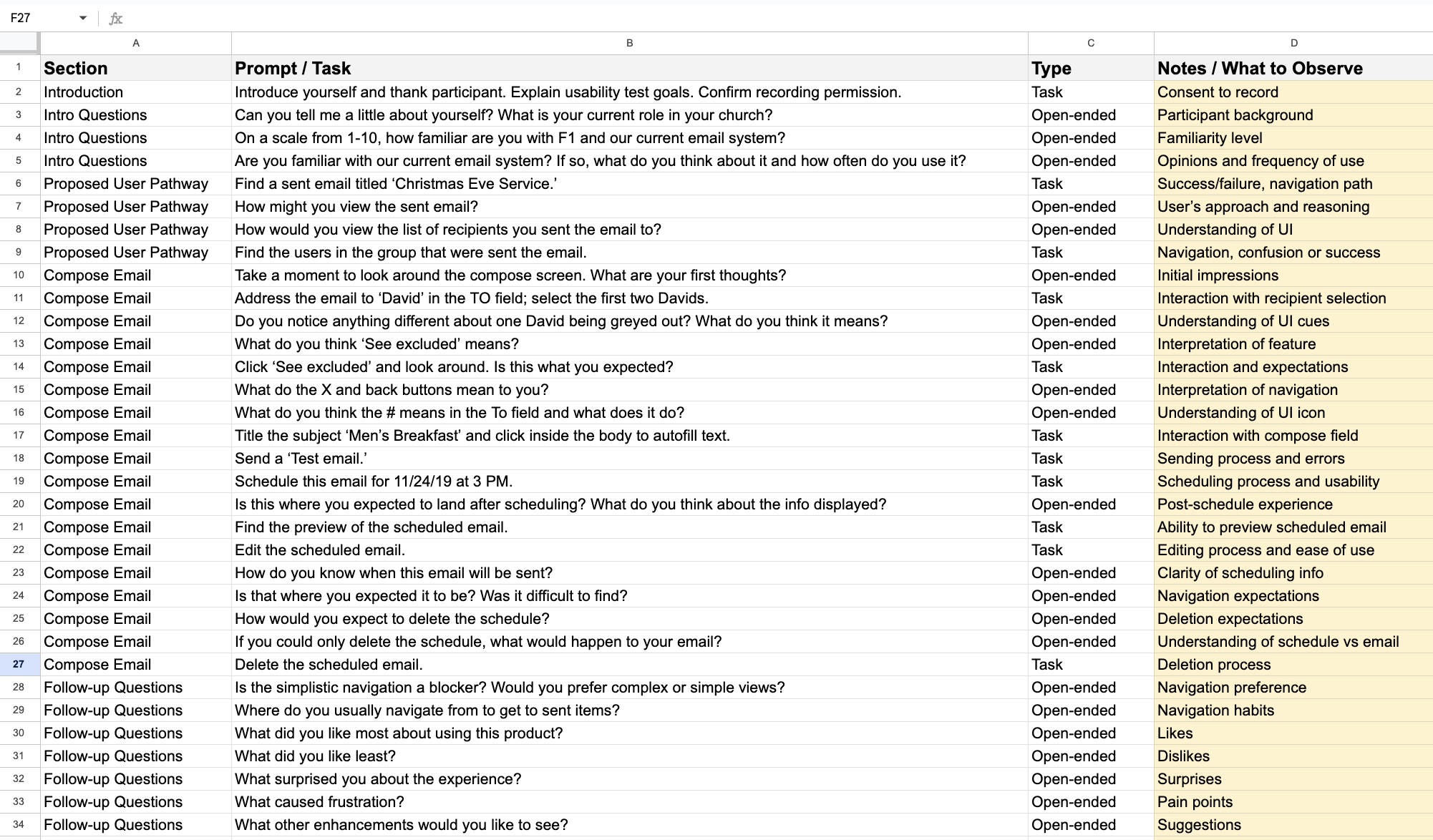
To ensure a structured and effective user testing session, I created a detailed script that included both task-based scenarios and open-ended questions. The script guided participants through key workflows while capturing usability insights, user expectations, and potential pain points.
The table below outlines the planned prompts, categorized by section, along with the feedback type and key observation points.
During testing, I shared an Adobe XD prototype of the proposed email experience to gather targeted feedback on design and functionality.
Final High Fidelity Email Experience
For the detailed design phase, I switched to a horizontal tab layout because it better accommodated the content that needed to span the horizontal space, giving us more room. After usability testing, I made final refinements based on observed user feedback, ensuring the experience was intuitive, efficient, and aligned with user expectations.